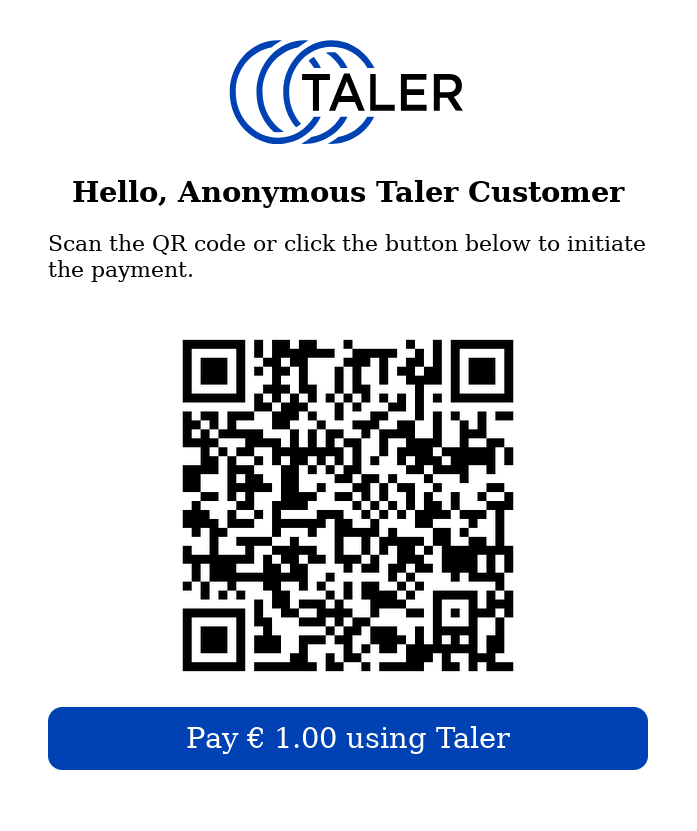
I wonder whether there is some suggested design for the “checkout page” in web-shops. With “checkout page” I mean the page shown to the customer after they choose “pay with Taler” and showing the QR-code and a button/link to pay with the browser’s wallet. See attached example.
Also a common wording (in different languages) would be great.
Rational: When using a common design, there is a recognition value , which is growing over time.
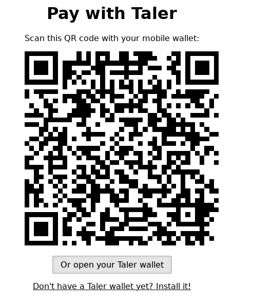
I just discovered that the merchant backend already provided such a page, see below. This page is shown when accessing $INSTANCE/orders/$ORDER_ID.
Anyhow, there is one major issue with this page IMHO: If the wallet extension is enabled in the browser, this page immediately redirects to the wallet in the browser. This inhibits that the customer may choose to pay with their mobile wallet. This is why I suggest to us a different page.
Also shops may want to provide a Taler checkout page of their own since
a) they can use more of the same code for different payment systems
b) they may want to use a pop-up or overlay
c) they may want to style the checkout page according the the shops design