After a proposal to extend TALER URI on the mailing list, I was brainstorming how to include P2P payments in flohmarkt UX wise.
Same as how TALER P2P payments work, we need two directions for P2P transfers:
For both cases, there should be an individual <button> in flohmarkt toolbar:
- “Request item payment” (shown for item owner)
- “Send item payment” (shown only for the person who is in conversation with item owner and has been
Assigned to the item)
After click on the button, there could be a small <dialog> with prefilled
- Amount (editable field)
- Summary containing item title (editable field)
- Expiration date (radio buttons with a default, compare TALER wallet)
-
- further info text (how to install TALER wallet for example)
- a
Open TALER wallet for Request/Send button
The Open TALER wallet button passes all fields strings to a target=_blank new page /pay-push or pay-pull redirect with query parameters, e.g. /pay-push/?amount=KUDOS:1&summary=itemTitleFoo".
The new page is just a dummy page, which contains
<meta name="taler-uri" content="taler://pay-push/?amount=KUDOS:1&summary=foo"> to open the (installed) TALER wallet instantly.
Once Taler URI is extended by those query parameter, it’s possible to prefill the wallet’s Request/Send dialog.
The user would have to click the Create button in their wallet and Copy the created link back to the transfer partner.
2 Likes
Additionally, TALER payment buttons for an item could be shown only when enabled for a /new flohmarkt item.
Ref: #415 - Rework new item page - flohmarkt/flohmarkt - Codeberg.org
(Of course, item participants can always agree on doing an online payment via chat the way they prefer)
Here’s a visualization of the ux flow:
p2p-taler-flohmarkt-ux-flow-v1.odg (24.2 KB)
1 Like
There is no need to open a dummy page with the meta tag. There is a taler script that hijack all the <a /> where the href points to some taler:// URI.
For example, try it with the bank in bank.demo.taler.net. When you create a withdrawal (and you don’t have the “open the wallet automatically”) you will land on a screen that has a QR code and a <a href />
The open automatically is inteded to skip this view if you have the wallet installed (for a better UX with less clicks). Take that into consideration when you design your page.
More info here 10.39. DD 39: Taler Wallet Browser Integration Considerations — GNU Taler
In these situations a <a /> is better than a <button /> because the browser gives you more information when you hover over it.
Hope this helps
2 Likes
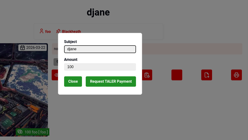
Here’s a screenshot of a (possible) implementation of the approach in flohmart.
There is a toolbar including a “TALER button” (logo still missing) which opens the dialog presented in the foreground. Right now, this dialog has a prefilled (and readonly) input for “Subject” and “Amount”. You can trigger an action to open the TALER wallet with “Request TALER Payment” button.